Brief
You must submit a digital sketchbook of 2D artwork with pages that you produce weekly throughout the module, that adequately demonstrates your achievement of the relevant assignment competencies. In this case, you must demonstrate:
- PC1: GENERATING IDEAS INFORMED BY RESEARCH – Conduct thorough research from a range of partially-prescribed sources to inform original ideas, concepts and solutions to proposed creative problems or self-initiated activity.
- PC2: COMMUNICATION – Communicate and present concepts accurately to audiences through a range of specified mediums
- PC8: REFLECTION – Reflect and evaluate on performance in order to inform personal development and continued learning of new skills
During the module you will have been encouraged in exploring a range of tools and processes used to develop graphical artwork for games. Applications of these tools could include thumbnail sketches, concept art sketches for characters, environments, vehicles, etc., UI and HUD Design and assets for games such as pixel art or vector graphics. You may include artwork created for your game design documentation/games in Game Design & Prototyping.
You may submit the sketchbook as:
- A series of blog posts on your wordpress blog
- A PDF document
It is important that you provide some written/visual annotations that discuss the process for your art pieces. You should discuss the creative process in your art pieces, how you felt about them and reflection on your finished work. How could it have been improved? You should also showcase your research/inspirations in the form of references/moodboards.
How will my Sketchbook of Artwork be Assessed?
You will receive a mark out of 100 for your work.
Based on the competencies above you should think about:
- Is the artwork produced appropriate? (PC2: Communication) (PC1: Generate Ideas Informed by Research)
- Is it clear what you are trying to achieve with your art pieces and what they are for? (PC2: Communication) (PC1: Generate Ideas Informed by Research)
- is the artwork high quality? (PC2: Communication)
- Have suitable explanations been given regarding the process of producing the art? (PC8: Reflection)
(Low Mark – low quality, ambiguous artwork with minimal annotations) – High Mark (purposeful, high quality artwork with detailed annotations)
- Has an appropriate amount of exploration been made into different aspects of 2D art for games? (PC2: Communication)
- Is there a wealth of attempts at 2D art present within the submission? (PC2: Communication)
- Does the document offer the “complete” picture of exploration of artwork? (PC1: Generate Ideas Informed by Research) (PC8: Reflection)
(Low Mark – basic and minimal attempts at 2D art present) – (High Mark – a wealth of attempts and a diverse exploration of techniques)
- Is the digital sketchbook to a professional standard? (PC2: Communication)
- Are the annotations free of spelling and grammar mistakes? (PC2: Communication)
- Is the digital sketchbook presented and delivered in a professional way? (PC2: Communication)
Introduction
This sketchbook will document 10 weeks of 2D artwork throughout my first trimester and will serve as a starting point of my time at university as something to look back on. I will be explaining my thought processes behind my artwork and the design features best I can, whilst letting the pieces speak for themselves where I can.
Week 1 – Character Concept
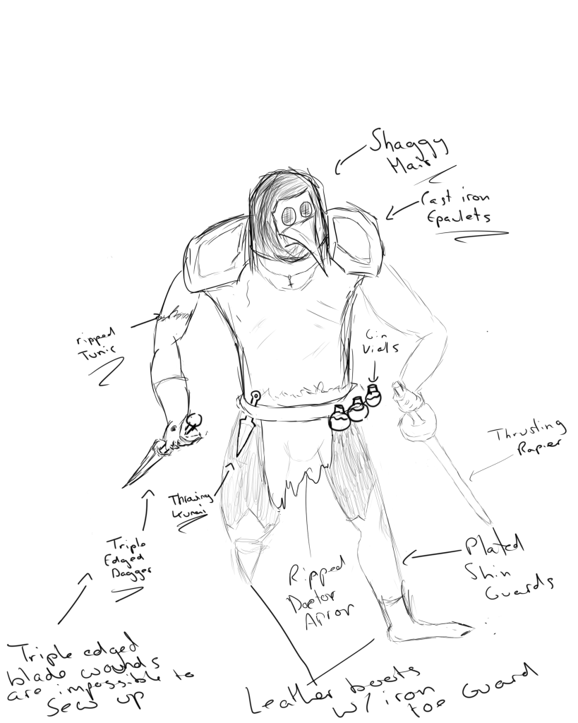
Our first task was to create a concept sketch of a character. There were no limitations as such but just to use whatever inspirations came to mind. My first thought was to make a character akin to the protagonist of a game I had played prior called ‘Thymesia’ and created my character with a plague doctor/assassin aesthetic.
Starting from the top of the character, the shaggy hair helps the character fit in with the time period of plague doctors being in fruition. Cast iron would have been a more popular material as opposed to something like steel or copper among people therefore I decided that his armour would be no more than that. Besides that the character very much lives up to the assassin archetype with the light clothing & essential armour pieces. He also carries vials of gin on his belt, as in those times gin was seen as being able to help fend off the plague.
I did create the weapons very particularly though. Being a plague doctor, he would want to spend as little amount of time around people as he could, so he uses a thrusting rapier as his weapon of choice to maximise range whilst not being rendered as immobile enough like a spear would make him. His off hand dagger was a 3 edged, bayonet-style dagger as a wound made by a triple edged blade is impossible to stitch up.
Week 2 – Photo mash-up
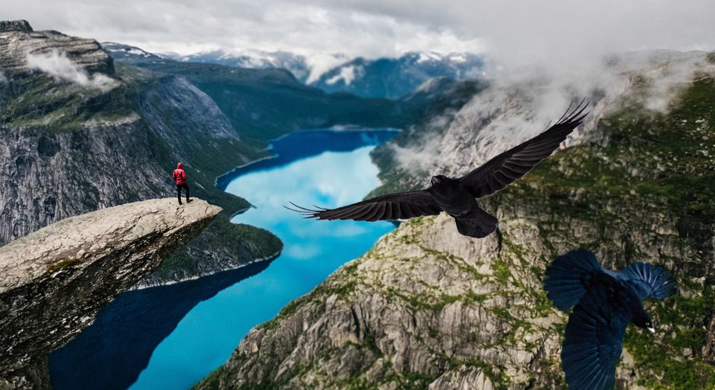
Nordic mythology is one of my largest interests and a subtle representation is what I have aimed to show in this picture. The landscape chosen is a Norwegian Fjord and in the picture I added two ravens. Alongside the fact ravens are some of my personal favourite animals, two ravens are highly symbolistic in Norse mythology as the ravens Huginn & Muninn. As the tales of old tell, Huginn & Muninn would explore the realms in search of information and bring it back to Odinn. That is exactly what I have tried to capture here is the two ravens exploring this Fjord but bringing it into a modern setting.
Week 3 – UI Button Design
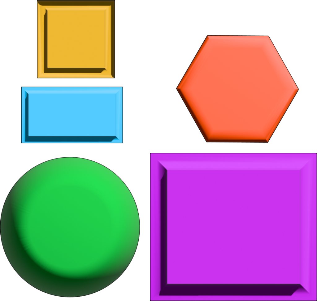
This week I decided to create a wide variety of of buttons that could have uses in multiple areas, hence the generic theme. Although being generic use buttons, I wanted to give them a bit of depth. So using adobe illustrator I sculpted them with a bevel tool to give them a more 3D feel, which also added natural shading. This really helps the buttons stand out and feel like you are actually about to press it without even touching it.
Week 4 – Perspective Drawing
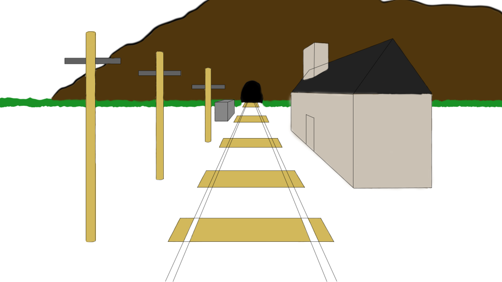
The result of my perspective drawing task is a very simple one point perspective piece. I chose a railway track with a tunnel in the background as I felt that it added a certain mystery to the piece. I also added a mountain in the background, and some foreground clutter to attract the eye and focus attention elsewhere.
Week 5 – Top Down Art
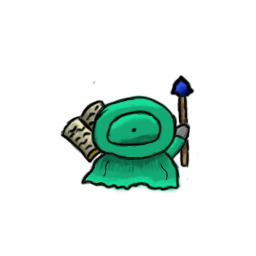
My first design for the top down task was a player age character. I used a blue/green combo at hues which complimented each other very nicely and used a nice light tan brown with a book to keep a contrast. The contrast was not too overpowering, but just enough to create more eye candy & depth.
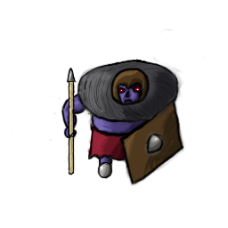
My second design was an enemy sprite that I based around an ogre type enemy. Using a lot of dark colours to emphasise the evil nature of him I feel that I have really created a decent enemy sprite. Using source lighting I also feel that I have shaded him well enough to fit any environment.
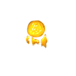
My last design was a projectile created by the player character, a simple fireball. I have designed it in a way to have a dynamic looking projectile on the move. It is a fluid looking fireball even in the sprite that can only seek to improve once brought into a game environment.
Week 6 – Pixel Art


My attempt at pixel art was using the character concept idea from the previous week. I used the same shade of green & blue and created a simple walking animation using three frames. This loop would loop back from frames 1-2-3-2-1 to create the full animation.
Week 8 – Anatomy & Character Design
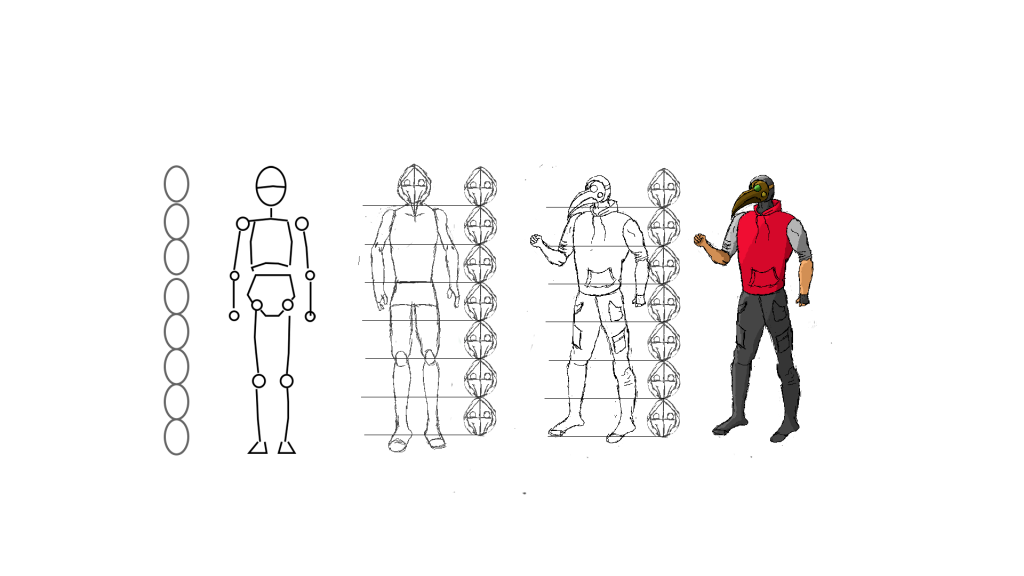
Using the template method given to help us create a character, I was able to make a modern take on my character from week 1. After some experimentation, I found that after finding a head shape and size I wanted for the character, I would use his head rather than some scaled circles as it would help maintain a dynamic feel & keep his body in proportion. This was semi inspired by the character ‘Smoke’ from ‘Tom Clancy’s Rainbow Six Siege’ where the character has a skin to make him look similar but more militarised. This concept of mine still incorporated the plague doctor mask design with a green lens. I used source lighting again to create a sense to the depth which I feel adds to the character.
Week 9 – Principles of Animation Pt. 1
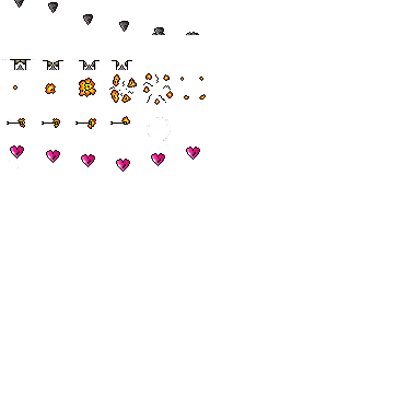
After designing so many character sprites, I decided I wanted a change of scenery and created some environment designs instead. Using a single sprite atlas I made 5 different pieces of environment that could be used in a simple platformer game. A falling rock, that drops from the roof and crumbles upon hitting the floor, an explosion that decreases in concentration from a centre point as it pushes pressure outwards, a trapdoor covering a spike that opens up underneath the player, a fire arrow that disintegrates after impact and a collectible spinning heart pickup.
Week 10 – Principles of Animation Pt. 2
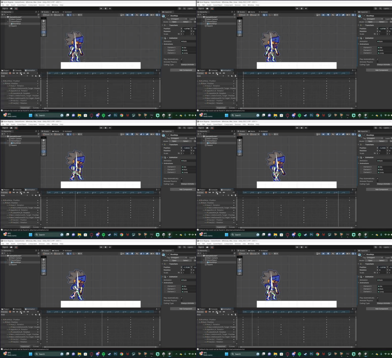
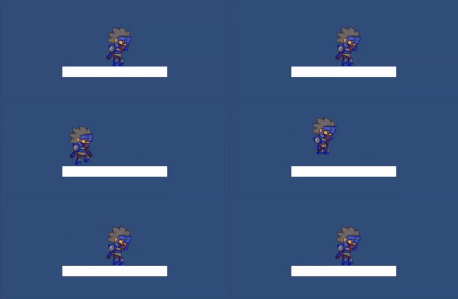
Using bone rigging in the unity engine, I was able to create three animations for a still sprite. This rig acted as a skeleton for the asset and I was able to assign different weights to the bones to get a fluid and lifelike movement as a final product. I then edited the position of the character at the different timestamps you can see on the image above, to create the motion of him moving and using all of his limbs to do so. I chose to display this first animation like this so you would have an inside to the animation process, whereas the below animations are the completed GIFS.

To Summarise
Personally, this project has been great for me to explore new areas of games design I had never touched on and help me get one step closer to understanding my end goals and how I might achieve them. I feel like I have pushed myself on the drawing aspect, giving good details on shading & source lighting helping reinforce the final product. I also feel that I have produced some good looking pixel art, which for me is a personal achievement as it is an area I was never captivated by, but having said that it was refreshing to explore something new.
I feel like I could have improved on the bone rigging animation somewhat. I was having trouble with parts of the silhouette that were joined together and not flowing completely isolated. I also struggled somewhat on the perspective drawing using a graphics tablet, as I felt the tools on the apps provided did not equate to that of drawing perspective in person and were too bulky for the job.